Images, printing and framing done exclusively by
Ned Radan, locally in Calgary, Alberta, Canada.
Besides, you can find more info about Ned Radan,
his mission statement, and comming
exhibits. If you want to make inquiry
to buy any of his art works, to custom frame, print or some other inquiry please
contact Ned Radan.
NAVIGATION
- Any highlighted word in this info is linked to the particular page -
- Click the logo located on the menu bar, top left, to access Home page at
any time.
- Home page is designed as menu page with links to most of the content -
- Menu icon on the menu bar, top right, is the most comprehensive way to navigate, as well as you can use this info which is located at the end of each page -
- This website is divided in two segments: Website and
Blog -
- Website is the main part featuring Ned Radan's works for sale, and info about Ned Radan. Typically you land first on the
Home page -
- Blog contains articles and pictures by Ned Radan,
in purpose of building good will. The main page is Blog Home
which lists available articles and albums -
In this essay I share my workflow of creating my portfolio image. It is an image of three tulips.
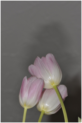
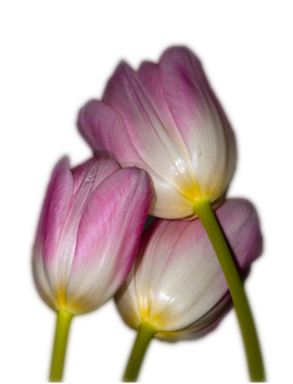
My wife got a very beautiful bouquet of tulips last Christmas. I really liked them, never saw tulips in pinkish color. So when guests left I took my camera to make a few shoots. I made 30-40 images and was not happy with outcome. I edited a few images but none of them turned to my satisfaction. So I forgot about them and recently rediscovered them. The image bellow came to my attention. I liked how the tulips are arranged together, the manner they hug each other.
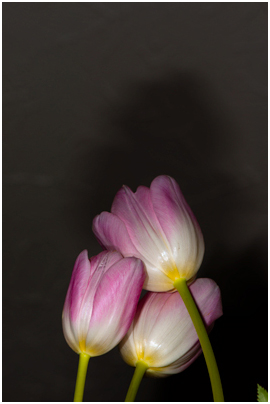
The photograph does not work. It has an unappealing composition and background. So I decided to play with it. What if I crop the image and get rid of grey wall? I decided to adjust saturation and brightness concentrating only on the flowers. The bright yellow and pink on the image below look promising.
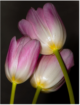
Next step is cropping the image. This type of images I usually crop in ratio 3:4 or 4:5. The bottom had to accept as is, because I needed the stems with their greenish color. I just wanted to leave small space between flowers and the edges.
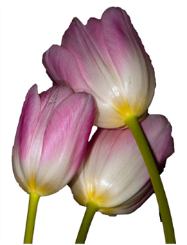
Now I needed to get rid of background. I used the magic wand tool to select the flowers. Which gave me a little rough edges, but I can work with it.
Then I made copy of the layer with flowers. On the bottom layer I applied blur. On the top one I partially erased edges using the feather selection. Then I joined theses two layers. The result was the flowers with smooth soft edges and sharp central part.
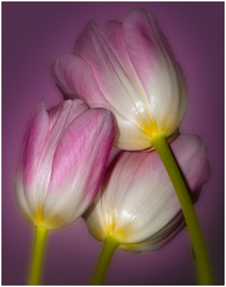
The next step was to choose the dominant color in the background. The first thought was that the background has to be darker than the flowers, otherwise background and the flowers would compete for attention. As well the background needed to be darker at the edges and going lighter toward the central part to lead viewer’s eyes toward the flowers. So I made another copy of the original layer with flowers and blurred it almost to the max, scaled it up and used that as a background. The result is shown on the image bellow.
At this point I could change background color, but I liked pink. I think the colors work very well. I did not like the central part of the flowers. It had too much detail, so I soften the whole image with a small amount of blur. This is the final image:
When I saw these flowers the first time, loved the color, texture and fragility of the leaves. They seemed sensitive to touch. I think I conveyed my initial feelings about these flowers in this photograph.
Images, printing and framing done exclusively by
Ned Radan, locally in Calgary, Alberta, Canada.
Besides, you can find more info about Ned Radan,
his mission statement, and comming
exhibits. If you want to make inquiry
to buy any of his art works, to custom frame, print or some other inquiry please
contact Ned Radan.
NAVIGATION
- Any highlighted word in this info is linked to the particular page -
- Click the logo located on the menu bar, top left, to access Home page at
any time.
- Home page is designed as menu page with links to most of the content -
- Menu icon on the menu bar, top right, is the most comprehensive way to navigate, as well as you can use this info which is located at the end of each page -
- This website is divided in two segments: Website and
Blog -
- Website is the main part featuring Ned Radan's works for sale, and info about Ned Radan. Typically you land first on the
Home page -
- Blog contains articles and pictures by Ned Radan,
in purpose of building good will. The main page is Blog Home
which lists available articles and albums -